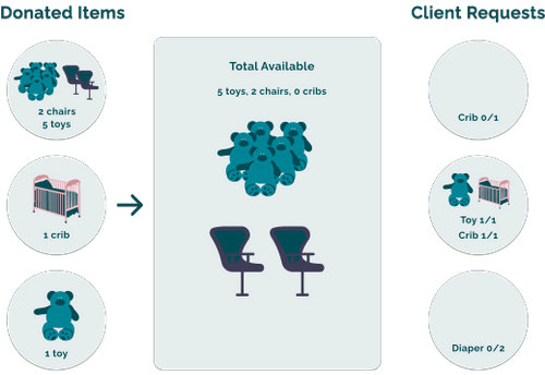
A Kitchener-Waterloo based non-profit organization helping local families make healthy and informed pregnancy decisions. One program they offer is their Care Closet where donors are able to fulfill donation requests (items needed) for clients (families) that need it.
Overview
Problem
With the growing number of donations and TPC's small team, it is difficult for them to evaluate incoming donations, determine a corresponding client need, and match the donation in a timely manner.
Currently the team is relying on a very inefficient and labour intensive process of manually checking the list of every client request to see if there is a donation match.
Outcome
A feature in the Donation Portal where TPC Admins are able to approve items for donation, match, and unmatch them. This removes the necessity for offline tracking, and reduces the amount of time taken to match an incoming donation to a client request.
My focus this term was to create the Admin side of the portal.
OUR OVERALL DESIGN STATEMENT WAS
How might we ensure that incoming donations are matched with the correct client request in a timely manner?
Determining the requirements
User stories
Since this feature was identified as one of the MVP features during project scoping, we determined the key functionalities needed based on the following user stories:
1
As a TPC Admin, I want to...
Be able to match and unmatch approved donations with active client needs
So that I can...
Provide clients with the correct item and reduce the manual effort required
2
As a TPC Admin, I want to...
View a list of incoming donation forms
So that I can...
Understand the item’s specifications and quality
3
As a TPC Admin, I want to...
Change status of a donation form automatically when an approval is made
So that I can...
Have a record of where each item is, and which ones are ready for donation
4
As a TPC Admin, I want to...
View a list of approved donation forms
So that I can...
Match only unapproved donations to clients
Throughout the design process, we used these user stories as the rationale for design decisions we made and how to prioritize the release of features.
Journey mapping
In order to understood how this feature would best fit in with the rest of the product, we created a journey map outlining the various entry points TPC Admin would have into the matching feature. We outlined the outcomes of where the matching feature would lead to after an item was matched.
Doing this made sure that we were thinking holistically about the entire user journey instead of focusing on the individual feature, providing the best solution to the problem space.
Design iterations
Based on our user stories and journey map, I began ideating different ways this information could be displayed and drew inspiration from various shopping sites and cart formats. The following three designs are some key iterations I explored.
Version One
The first version of the matching process allowed for TPC Admin to select an item to match and then simply assign it to a client. During this, I used a card display which is present in many online restaurant platforms.
However I realized that it was important to identify which donor provided what donation to the client in order to modify only their respective donation.
For example, if three different donors each provided one bassinet to a client and one was matched, the system needed to indicate to TPC which bassinet was removed.
Version Two
The first version of the matching process allowed for TPC Admin to select an item to match and then simply assign it to a client. During this, I used a card display which is present in many online restaurant platforms.
I set out three different colours: green for available, light grey for satisfied by current donor, and dark great for satisfied by a different donor.
From the previous designs, I changed the cards to be more visually indicative to make client capacity more clear. Allowing Admin to add/remove items in the card itself decreased the mental effort in connecting a donation to a client.
Splitting the screen into two allowed for Admin to switch between various items. This would simplify the interaction of assigning multiple items and would reduce the number of clicks needed.
An option to view the original donation form was also added to provide Admin with maximal information in the one page view without navigating back and forth.
While this was visually interesting, and a lot of fun for me to come up with, it didn’t necessarily provide the easy-to-understand solution that TPC wanted.
After doing some initial guerilla testing with those around me I realized that the graphical view in the cards was not a widely understood design pattern and would likely take time for TPC to understand.
Version Three
For the third version, I drew inspiration from the traditional 'Cart' (🛒) display used on various retailors' sites
In order to display more items and focus on the matching itself, instead of focusing on the possibility of TPC Admin assigning too many items, I displayed the client needs using a row format. This was a more intuitive design as a table was used with clear information.
Keeping with the previous design to reduce user mental effort, I kept the adding/removing feature near the client name to create visual association.
I removed the client view on the side to create more white space but noticed that removing it created a lot of friction in the user flow, and decided to continue with having a split screen.
Three versions of the Cart screen
However, I did note that there was no character limit in the item description that could be entered, which meant that the likelihood of the content not fitting in the bottom banner was very high. Due to this, I decided to change it to a banner on the right side.
Chatting with our devs
After presenting some of these ideas to our project manager and technical project lead we found that the technical feasibility of some of our features was very low, given the short timeframes the product had to be launched in. Due to this, we went back to the drawing board to determine the functionality that could be developed to meet the requirements and decided to modify our designs based on what was technically feasible. We came up with the following options for the process which the Admin could use when navigating our platform:
1
Individual donation items not associated with a donation request but are linked to a client request. Decrementing would be manually done.
2
Individual donation items are not linked to a donation request or client request, but will automatically be decremented upon being matched.
3
Individual donation items get linked to a donation and client request, but the incrementation and status change is manual.
After discussing the options, we went with option three which allowed the most in-depth view of where the item was going, but resulted in an additional click for the user. I also decided to add another column which would automatically keep track of the total items still required for the client, while the editable column would be for the specific donor being changed.
Usability testing
In order to determine if the feature met the requirements of TPC Admin, we conducted a walk-through usability test with TPC. We also provided the team with access to the system for several weeks to get more feedback as the team began to integrate the platform within their workflow. Based on the usability tests we made the following changes:
Implemented an additional exit point through the 'Forms' in the header, to reduce the interactions needed to exit the system.
Added a 'TPC client' to facilitate the record-keeping of offline matching while reducing the manual effort in creating a new client profile.
Created video walkthroughs to explain the matching process as an introduction to the platform to ensure that TPC Admin understood the difference between 'Quantity' and 'Total Required'.
While there is still a certain level of complexity in the system, it is important to acknowledge that for any system there is a certain amount of complexity that cannot be reduced and must be absorbed by either the system or the user, which in this case is done through the separation of the 'Quantity' and 'Total Required'.


.svg)